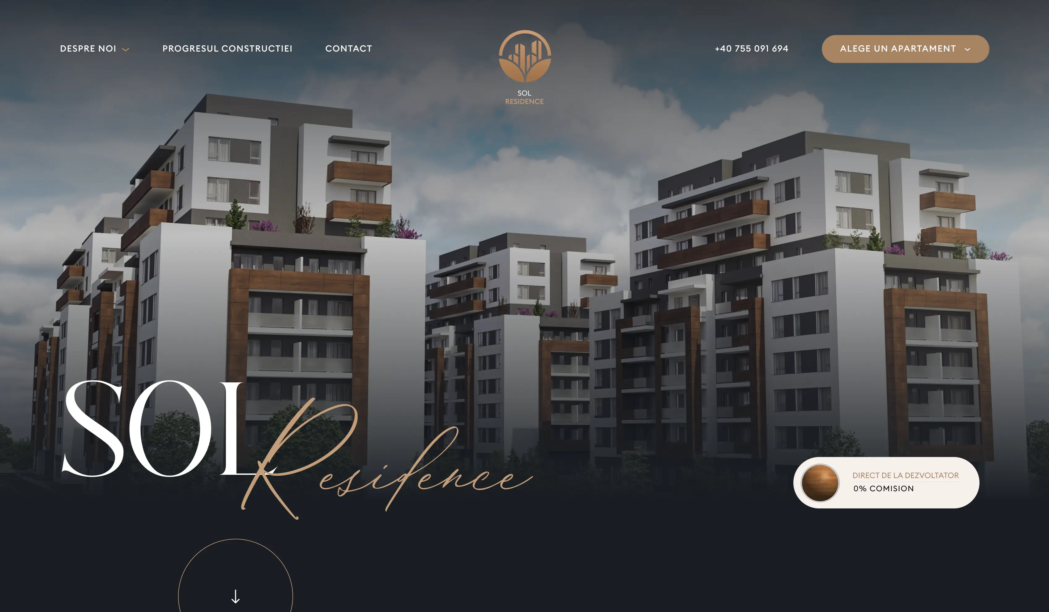
Romanian residential developers default to the same brochure-site template — drone hero, three CTAs, a floorplan PDF. SOL Residence is positioned as the alternative. The hero leads with the commercial line that actually matters to the buyer — direct from the developer, zero broker commission — and names the location before it names the building. The opening filters for the buyer who's already serious and skips the rest. Walk-in traffic to the show-apartment goes up; speculative inquiries go down.
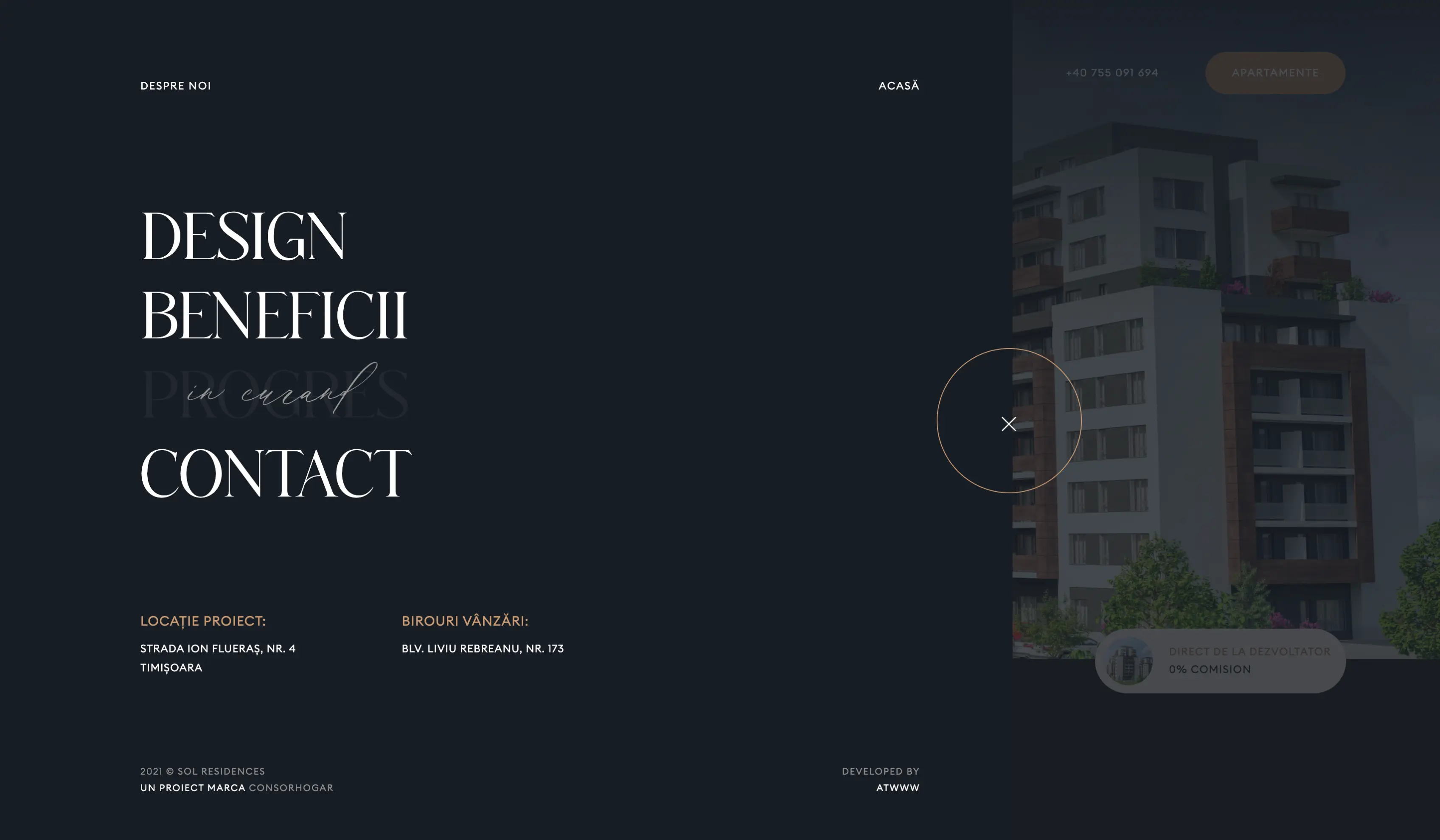

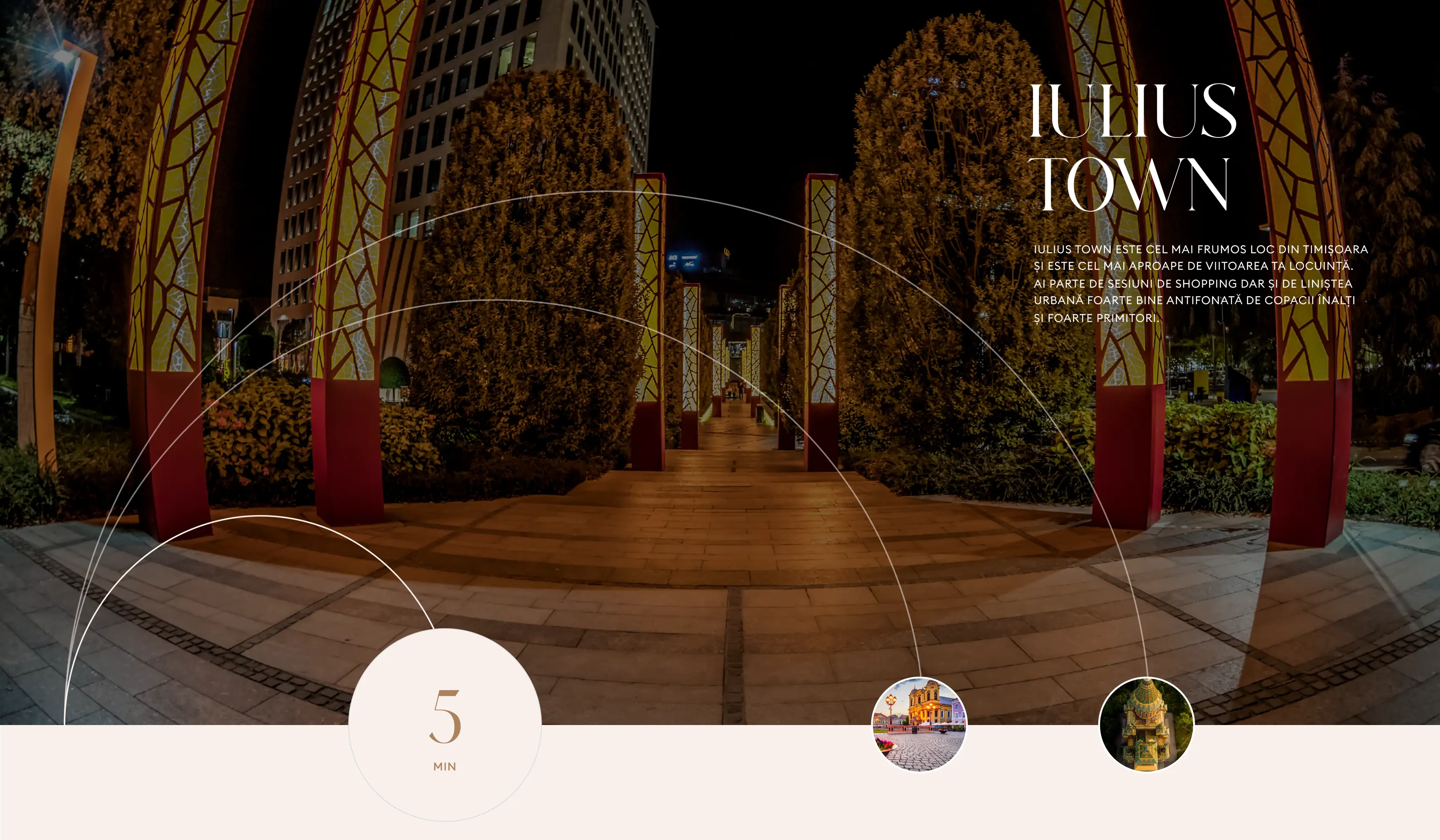
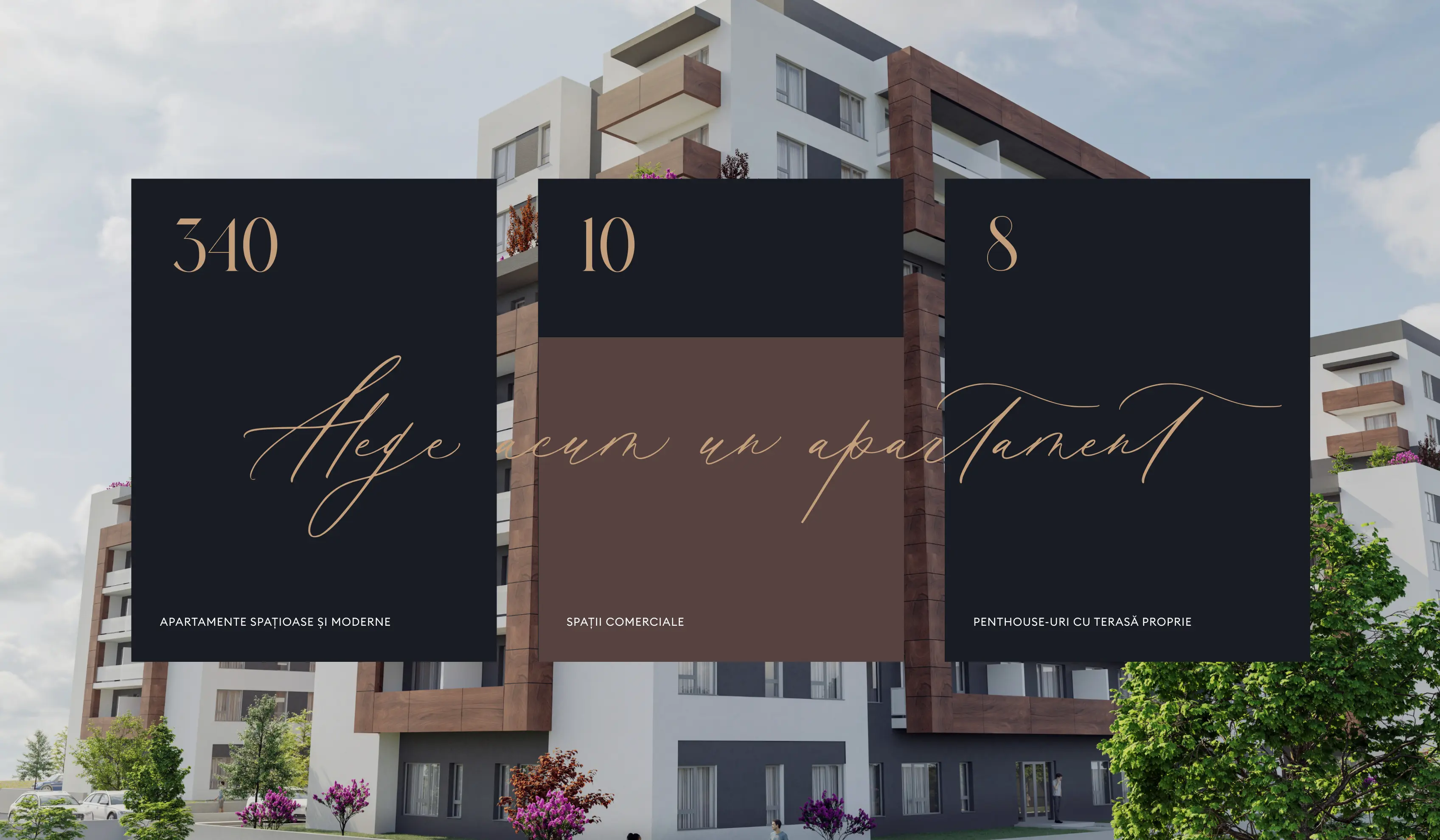
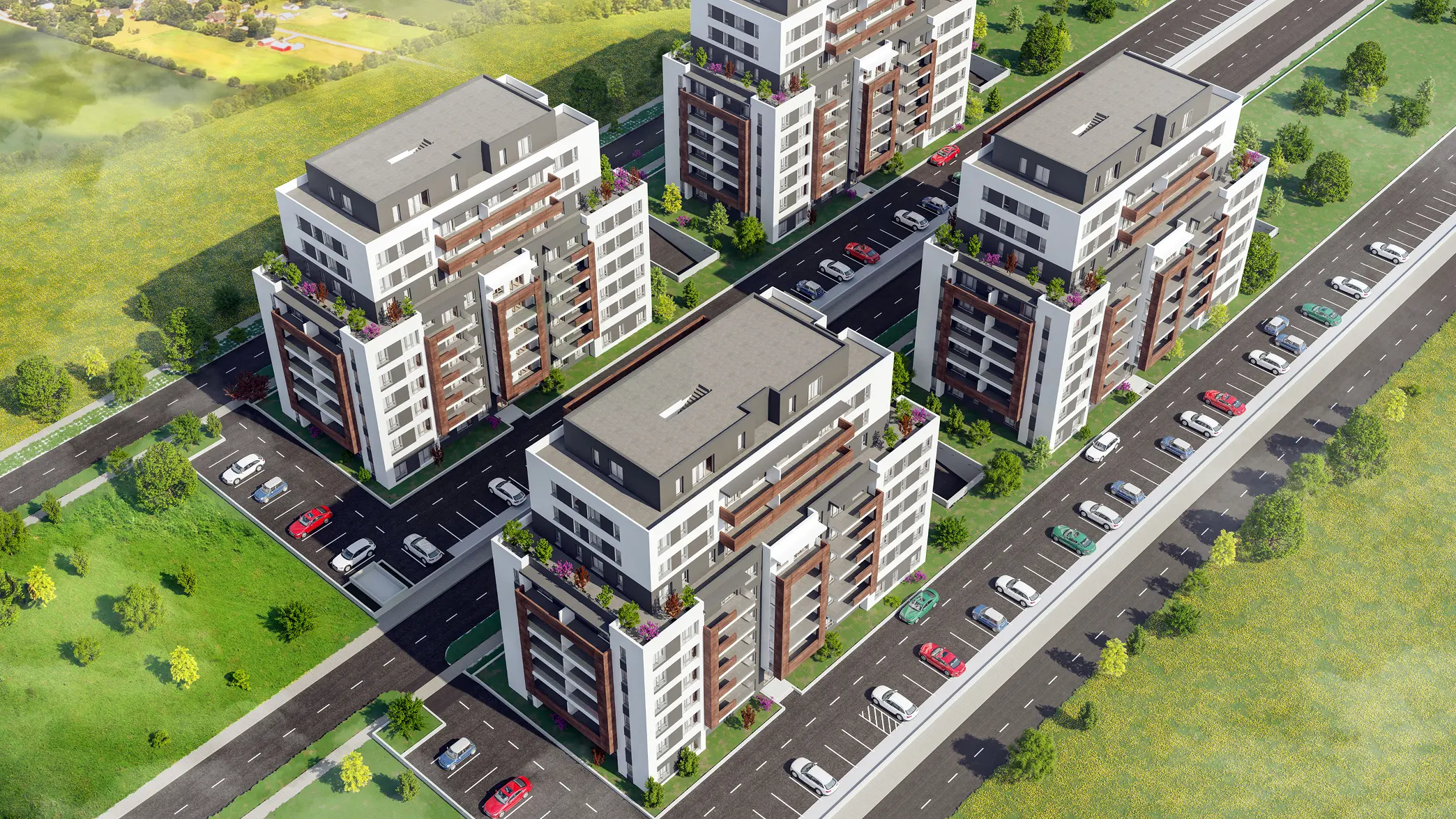
Most luxury residential sites describe the apartment. We described the territory around it. The infrastructure section maps the city as a set of concentric 5-minute rings with the building at the center — proximity becomes the narrative, the floorplan comes second. Key counts (apartments, commercial units, penthouses, parking capacity) sit beside the photography, not under it. The brand surface runs bilingual so foreign-currency buyers and local buyers read the same page —> one site, two markets, no separate microsite to maintain.
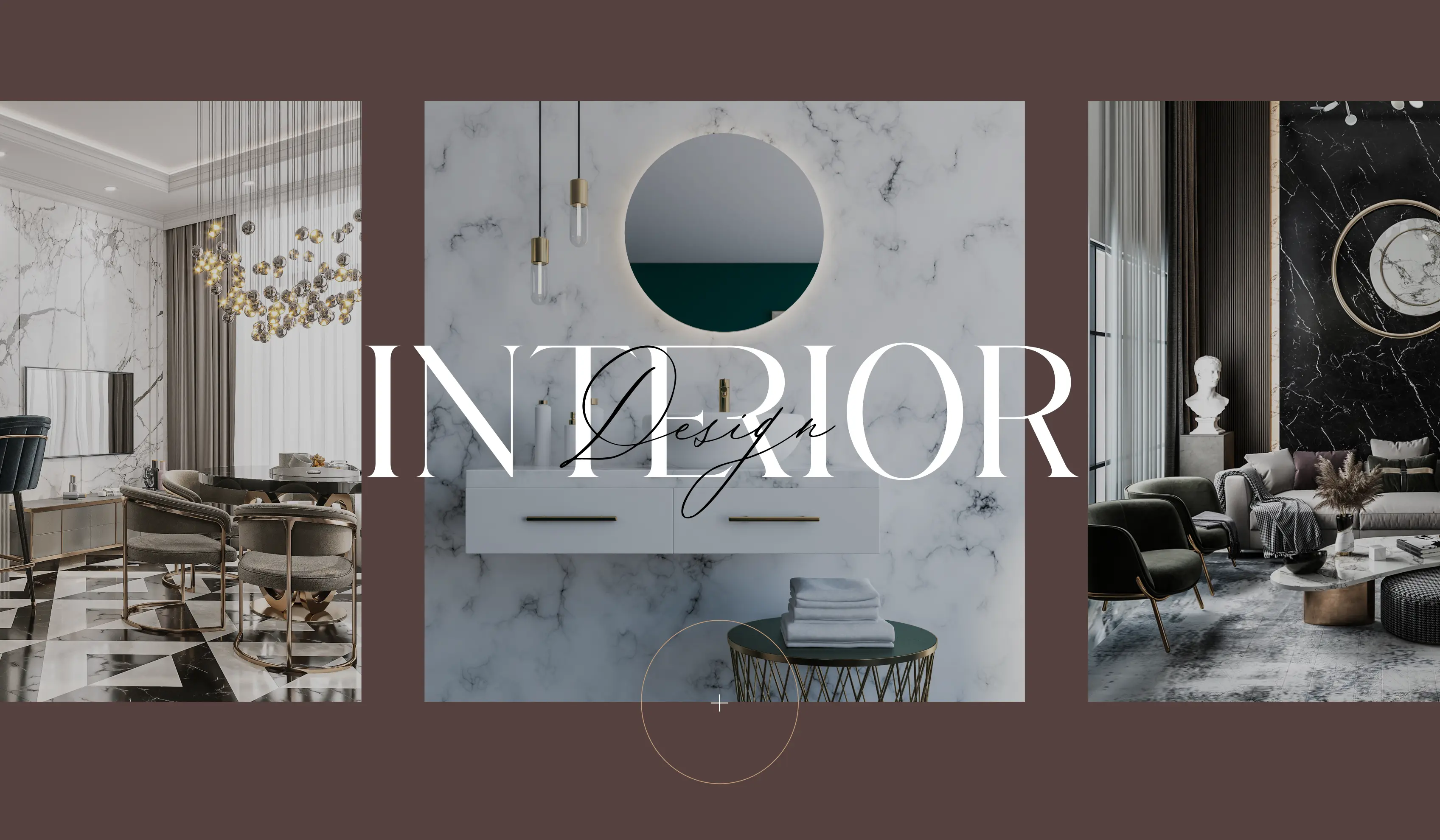
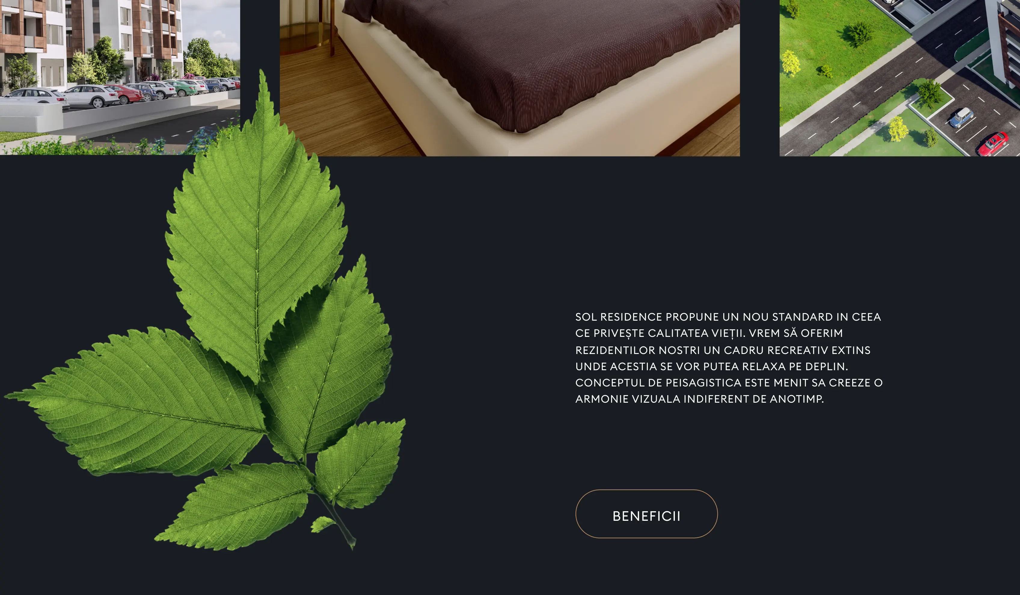

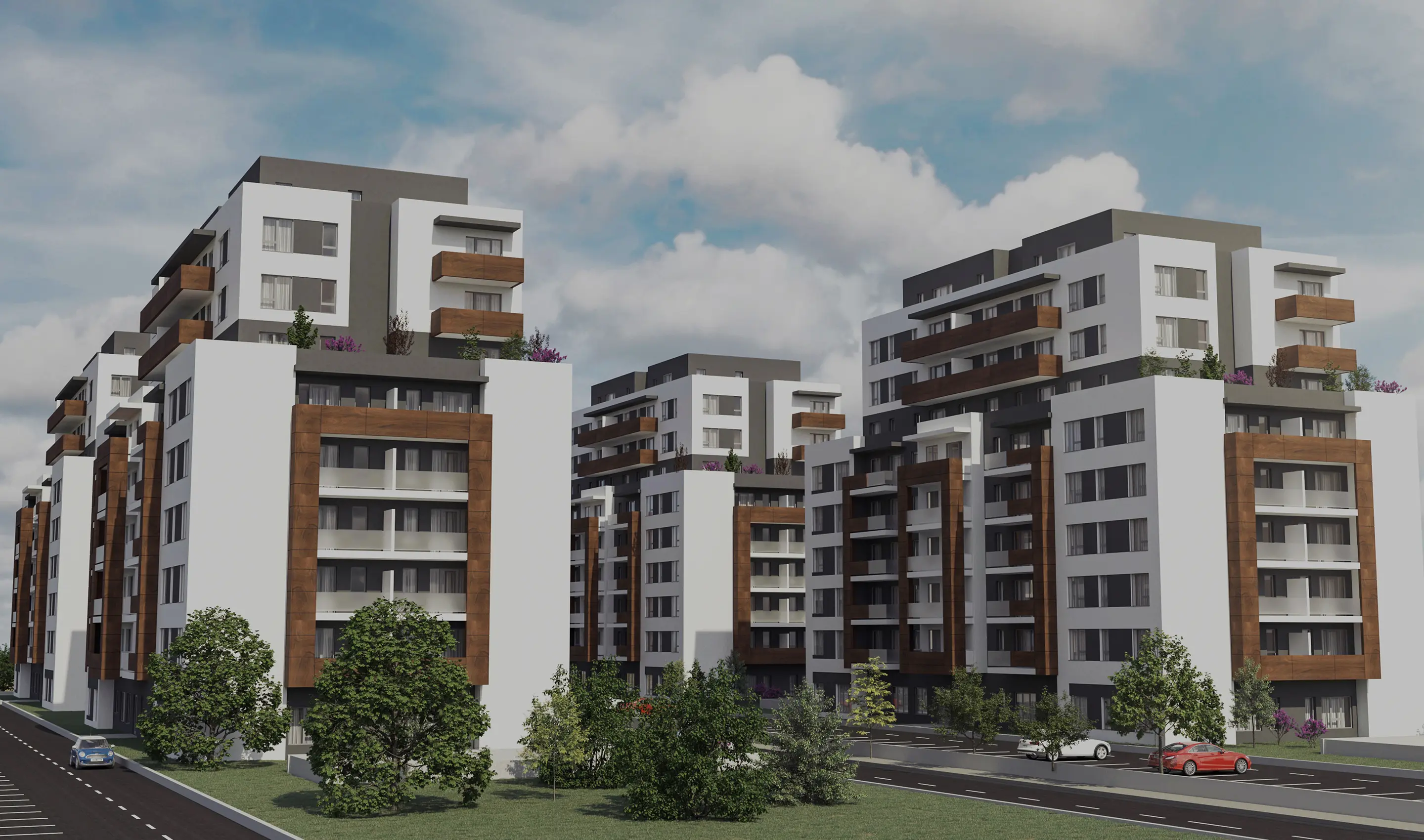
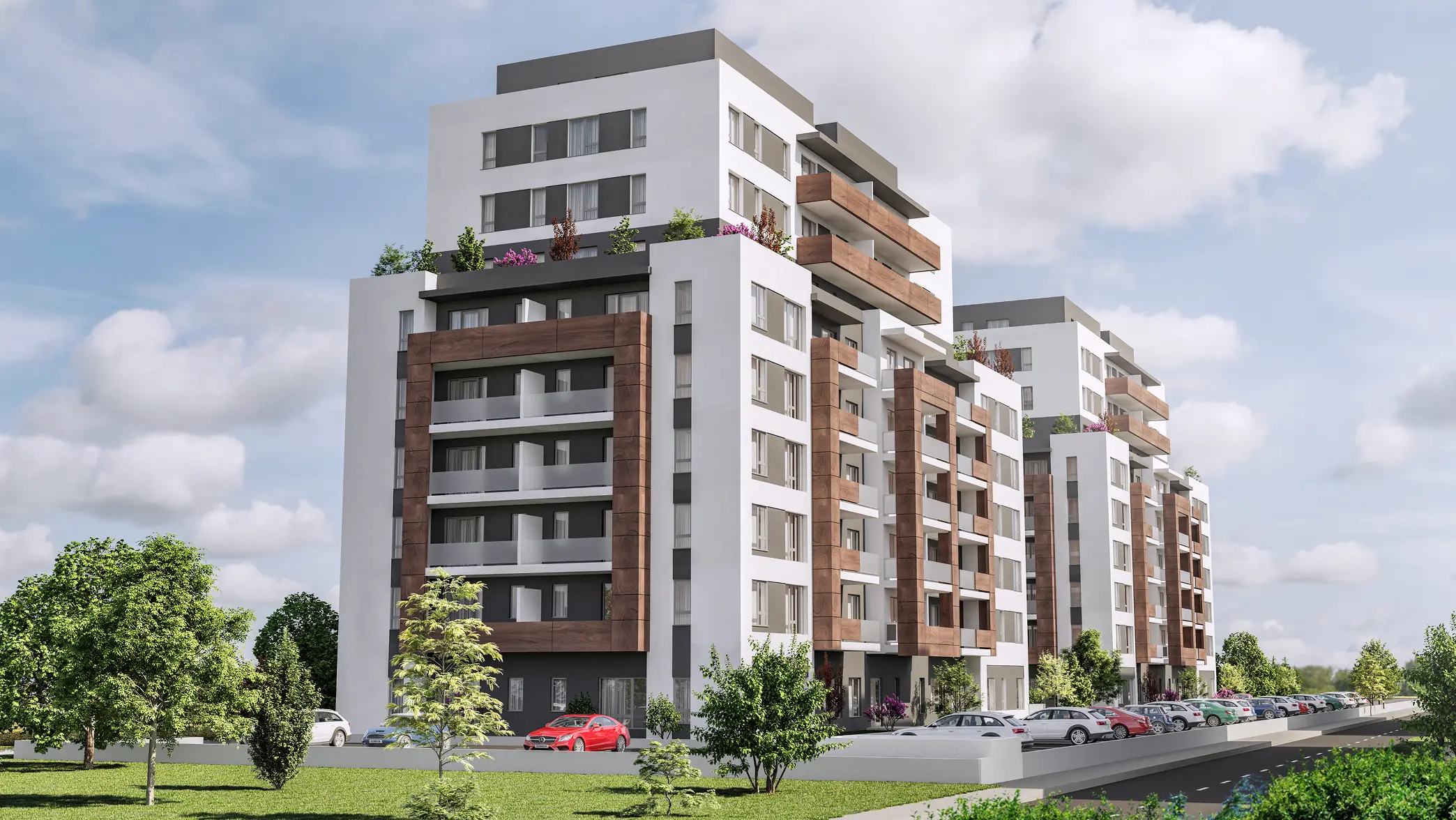
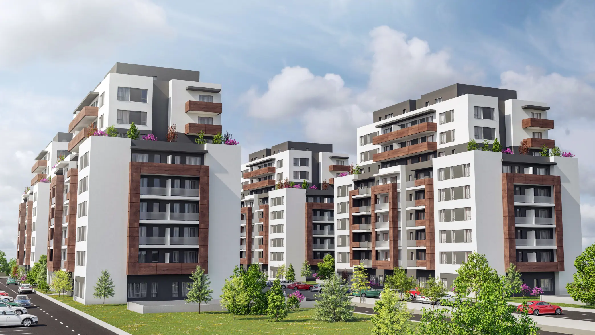
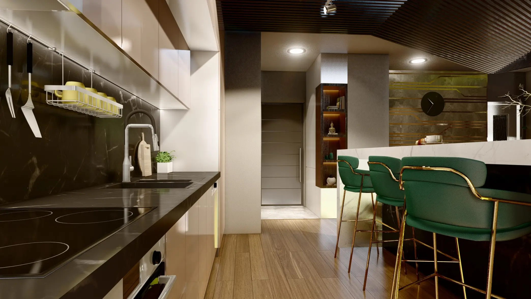
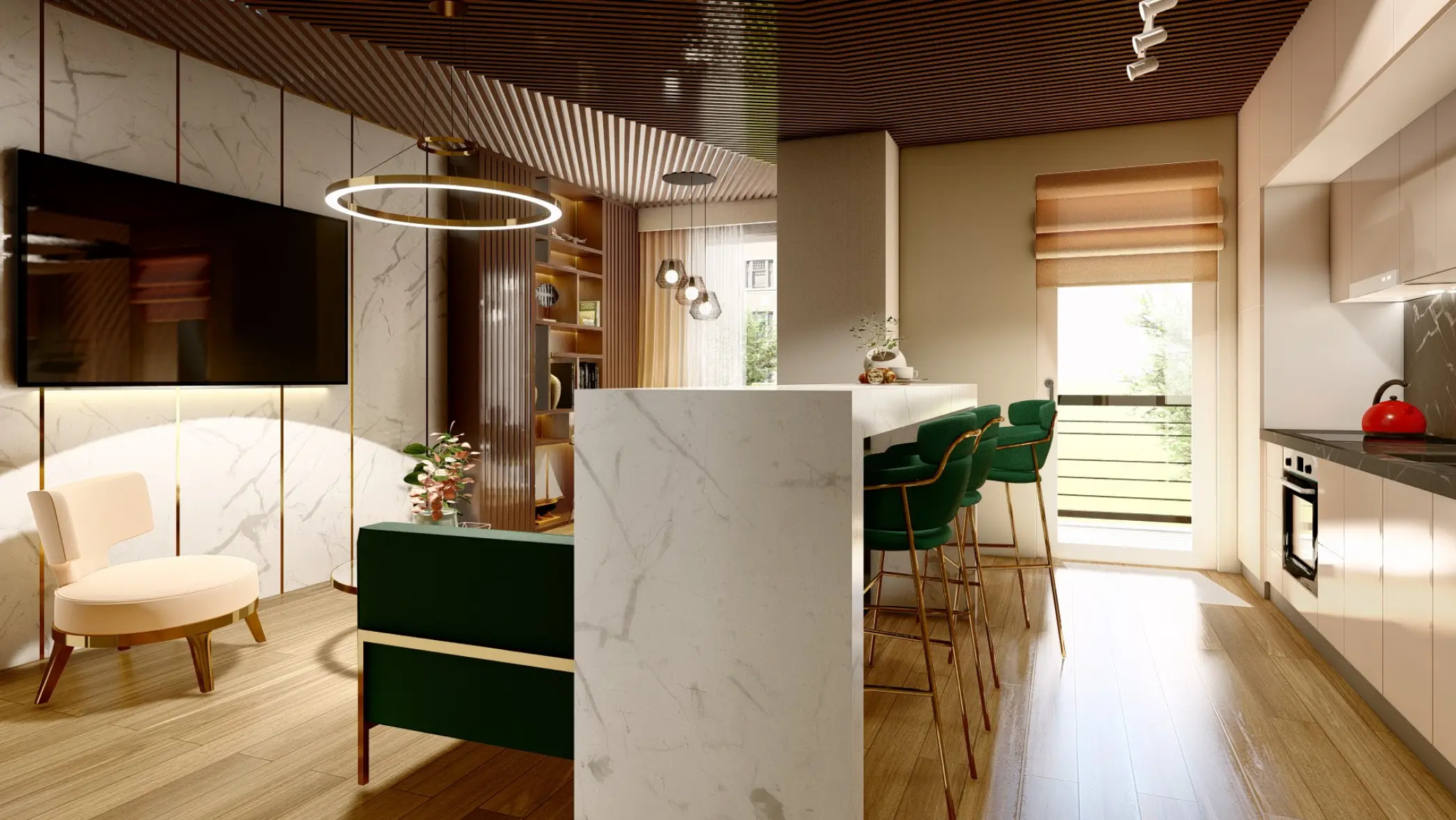
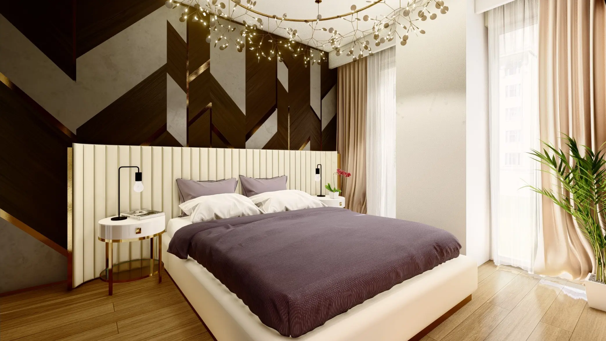
The renders carry the project. Construction was in flight when the site shipped, so the visual system is built around CGI exteriors, aerial massing, and interior compositions — the same source files the developer uses in sales meetings. Light is matched to the live site conditions, so the renders hold once the building opens and the photography catches up. One library covers the homepage, the presentation deck, and the eventual handover brochure. The developer ships a complete brand surface without waiting for the building to finish.
Most agencies treat interaction design as an afterthought — a few effects layered on before launch. Here, it’s part of the team structure. Interaction architecture isn’t an add-on. It’s part of how every page gets designed from the start.
